Mastering the Art of Responsive WP Designs: A Comprehensive Guide

1 September 2023
In the ever-evolving landscape of web development, responsive design has become a cornerstone for creating websites that seamlessly adapt to various devices and screen sizes. Mastering the art of responsive WordPress (WP) designs is crucial for ensuring an optimal user experience across desktops, tablets, and smartphones. In this comprehensive guide, we’ll delve into the principles, tools, and best practices that will empower you to create responsive WP designs with finesse.
Understanding Responsive Design
Responsive design is not just a trend; it’s a necessity in today’s multi-device world. At its core, responsive design involves creating layouts that fluidly adjust to different screen sizes, ensuring content remains accessible and visually appealing. In the context of WordPress, this means optimizing themes and layouts to accommodate a diverse range of devices.
Key Principles of Responsive WP Designs
- Fluid Grids: Building a responsive layout starts with a fluid grid system. Rather than fixed pixel values, use relative units like percentages to create flexible grids that adapt to the viewport.
- Flexible Images: Images play a crucial role in web design. Ensure that images resize proportionally and maintain their quality across devices. Use the
max-widthproperty to prevent images from overflowing their containers.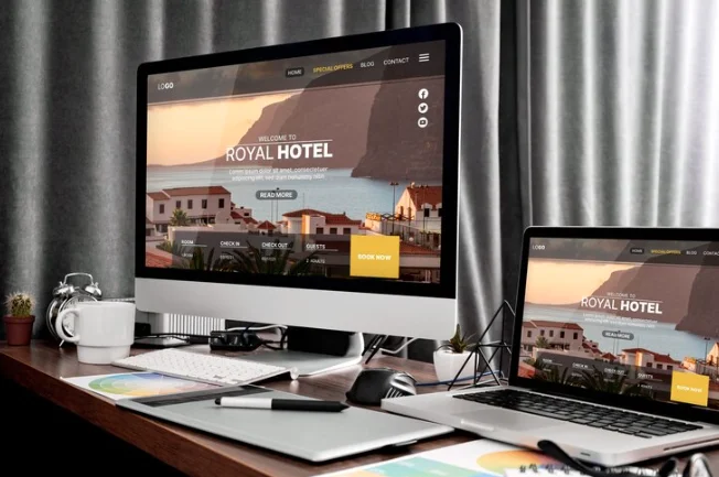
- Media Queries: CSS media queries are instrumental in tailoring styles based on device characteristics such as screen width, height, or orientation. This allows for a targeted approach to styling for different devices.
- Mobile-First Approach: Start designing for the smallest screens first and progressively enhance the layout for larger screens. This approach ensures a streamlined experience on mobile devices while taking advantage of larger screens when available.
Tools for Responsive Design in WordPress
- Responsive Themes: Choose WordPress themes that are explicitly designed to be responsive. Many modern themes come with built-in responsiveness, saving you the trouble of extensive customization.
- Page Builders: WordPress page builders like Elementor and Beaver Builder offer intuitive drag-and-drop interfaces with responsive design in mind. They enable you to visually create responsive layouts without delving into code.
- Viewport Meta Tag: Ensure your WordPress theme includes the viewport meta tag in its header. This tag informs the browser to scale the page properly on different devices.
Testing and Optimization
- Cross-Browser Compatibility: Test your responsive design across various browsers to ensure consistent performance. Browsers may interpret CSS differently, and testing helps iron out any discrepancies.
- Performance Optimization: Optimize your images and code to enhance page load speed. Slow-loading pages can lead to a poor user experience, particularly on mobile devices with slower internet connections.
Conclusion
Mastering responsive WP designs requires a combination of understanding fundamental principles, leveraging the right tools, and continuous testing and optimization. By adopting a responsive design approach, you not only cater to a diverse audience but also future-proof your website against the evolving landscape of digital devices.